Monday, December 10, 2007

Final Drawings, 9 Leaves


The picture is slightly cut off on the right side because it didn't fit the scanner. I really enjoyed doing this assignment and getting to use different types of drawing. My two favorite leaves are the blind contour and the one where I used random lines to shade.

Thursday, December 06, 2007

Foreign Design Journals

After looking at several buildings in the Italian journal, Abitare and Domus, also an Italian journal, I began to notice that many of the residential buildings were made up of horizontal rectangles. Many of their products and buildings that currently being made seem to be made up of smooth, clean lines. Italy has a rich history of both art and architecture dating back to classical times. I can only imagine that this is a enormous influence still today on all Italian work. After researching about Italian design I learned many interesting things. Not only is Italy the worlds leading furniture exporter and the second largest manufacturer, but they have been a vital part of the design world since the 1940s. Today Milan is a great place to go to learn about furniture design.

Architecture Australia, a journal from Australia. Australia uses a lot of wood in all of their designs. This is good as far as sustainability goes. Many Australian designers like to use materials that are native to Australia.

Archis, a journal from the Netherlands, gave an good view into their design. They are a big proponent for spacial planning in moth major and minor cities. They are also interested in the economic and social contribution of design. Like Australia, many designers from the Netherlands like to use wood as well. Many designs that I looked at featured modern designs of old fashioned styles. Angular forms were also a big deal especially in the design of buildings.

Ten Graphic/Media Designs


I chose to focus on CD covers for graphic media design because of the simplistic nature of most CD's. I started looking at graphic media designs in journals but wanted to have ten that all shared similar attributes.
1) The first graphic/media design I chose is the cover to one of the Shins CD's: Chutes too Narrow. I like this cover because even though all of the images are exceedingly flat, depth and perception are still very much a part of the composition. The simplicity of texture and detail really makes this album work.
2) Next is the album cover to The Academy Is's CD: Almost Here. This, once again, is an exceedingly simple cover. This cd shows depth by overlapping the flat images. The simplicity of color, mainly greens and browns also helps to center the cover.
3)Bleach Astronomy. This cover's colors consist of orange and blue. The image is colored ink dispersed into water?
4) Copeland, Beneath Medicine Trees. This cover is mainly a gray background. In the lower half is a black contour drawing of a man receiving cpr. Behind him is a sort of white table.
5)Fighting Jacks, The Dying Art of Life. This cover is a photo of a city with a sky full of clouds. Overlaid on top of this is a little girl wearing a black dress holding onto red balloons. She is in the cover several times, at several sizes and distances.
6)Further Seems Forever, The Moon is Down. This cover is a purple photo of an airplane on a tarmac. It is divided about 30-70 with a white stripe that contains the title. The planes on the top and bottom are facing different directions. Emphasis is placed on the engines.
7)Mae, The Everglow cover is a watercolor picture using browns, blues and greens. The only thing not in color is the boy in the middle. The painting is very sketchy. The layout is centered and symmetrical. The color starts to disappear at the edges.
8)Number One Gun, Celebrate Mistakes cover features a blue, white and gray photo of a city scape with a black and white picture of a little girl in the bottom right hand corner. The text at the top is red. The layout is not divided exactly in half (50-50)but is more like 70-30.
9)Sanctus Real, Fight the Tide. This cover consists of a simple blue wave with slim to no details.
10) The Working Title, About Face. One of the strongest things about this CD is the centrality of composition and color. Everything is centered and the colors consist only of red, black and white. The image itself is interesting. A human head with anatomical like sketches on it, with a winding key in the back of the head. The two lines at the bottom of the head balance out the heavy white top of the head where most of the white tangled lines are.

Ten Designers/Architects

One thing that I found to be very interesting about researching designers was that many of these people were in some other art field before they became architects. It was so interesting to see how this played into their buildings as you could see the different disciplines in their buildings.
1) Frank Lloyd Wright was very good at involving his building with the site that it was placed. The sites were always taken into account when he designed the buildings. A perfect example of this is Falling Water. He made the building reflect the both the rocks and the water of the waterfall. The material his buildings were made out of also reflected the site. I think it is really cool that Wright designed the entire houses down to the doorknobs.
2) Frank Gehry is very different from Frank Lloyd Wright in that respect. While many of Gehry's designs are organic and dynamic and nature, the site of the buildings do not incorporate this aspect. After watching the documentary Sketches of Frank Gehry I was able to really appreciate his sculptural-like designs much more than I think I would have had I not seen that document. One of the things that I may love even more than his actual buildings are his drawings. They are so rough and messy and yet the perfectly capture the essence of what he wants to show.
3) Le Corbusier. More than anything what I like about Le Corbusier is that he changed his name because he believed that anyone had the power to reinvent themselves. In addition to being a famous architect, Le Corbusier also was a brilliant furniture designer. interestingly enough, Le Corbusier came up with what he referred to in a book that he wrote that dealt with five points of architecture. Le Corbusier transacted these five points into reality when he built a house in Paris called the villa savoye.
4) Louis Kahn. Part of Kahn's preoccupation with architecture was incorporating human scale into the building. He, like Le Corbusier used concrete to build main parts of buildings. Among other things, he was interested in creating formal distinctions between served spaces and servant spaces which simply meant that he would use spaces such as stairwells as functional spaces.
5) Walter Gropius was a German architect who designed the Bauhaus which was a very innovative building for its time. This building introduced curtain walls or non load-bearing walls on steel frames. After the Bauhaus was shut down by Hitler for teaching "degenerist" art, he came to the United States where he had a very successful career.
6) Eliel Saarinen liked to build buildings that were the culmination of several different syles of art and architecture.
7) Albert Kahn developed a new style for building that had concrete instead of wood in factory walls and roofs.
8) Fumihiko Maki uses a lot of glass and metal in his buildings.
9) Ludwig Mies Van Der Rohe is quoted for saying "less is more" and "God is in the details".
10) Aldo Rossi is well known not only for architecture but also for his theory and drawing skills. Rossi believed that cities had to be understood as a whole and that buildings had to be considered in this. He wrote several books that explain this concept.

Ten Buildings


Of course I cannot conduct design research on buildings with out running across something of Frank Gehry's. 1)The first building I love of Gehry's is the Guggenheim Museum Bilbao. I recently rented a documentary from the TLC about Frank Gehry titled, Sketches of Frank Gehry. This documentary gave a facinating look into the way that Gehry designs buildings and sketches them and how his whole ideation process works. I found this documentary to be both educational and inspiring. This building was one of the buildings that was featured in the documentary. I love the way that this building is sculptural and cubist in nature.
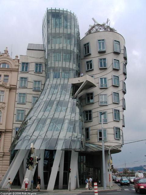
2)The second Gehry building that I really enjoy is titled Dancing Building. I love the way that the central tower spirals around the other, how an extremely dynamic form is integrated into static forms. This is what I appreciate most about Gehry's work, and why I love these two buildings that he designed.
3)The next building I want to discuss is the Robie House by Frank Lloyd Wright. What I appreciate about this house is its extreme horizontal nature. The only vertical line in the entire house is the chimney in the center of the house. I also enjoy how different and groundbreaking this building was in relation to all of the other houses being built at the time that this house was. It was truly an innovation.
4)Next is the Bauhaus by Walter Gropius. This building like the Robie house was also very innovative for its time. Although, I suppose that that is kind of irrelevant statement since all of these buildings I have discussed thus far have been extremely innovative. I love the clean lines and the static elegance of this building. I also love the entire walls of membraned windows.
5)The next building is the Helsinki Central Railway Station by Eliel Saarinen. I really like how the the architecture of this buildings looks both conservative and modern. I also like the contrast of colors that building has of the red brick, green accents and black roof.
6)Whitcomb Conservatory by Albert Kahn. The beautiful full sized dome is what really makes this buiding. The material that it is made out of is likewise very pretty. Further down the more squared off dome looks very natural with this building as do the other angles because the edges are all rounded off so that the blend with the extreme rotundness of the initial dome.
7) Spiral House by Fumihiko Maki. I love the way that the walls of this building are sectioned into cubes. It makes the breaks caused by windows and balconies to seem very natural and uninterrupted. The different heights of the building is likewise a very natural change because of this.
8)Seagram Building by Ludwig Mies Van Der Rohe. The sleek, black elegance of this building is what really captures the viewers attention. I also really like how the solid black cap at the top of the building is balanced out by the equally sized void at the bottom.
9) Kimbell Art Museum by Louis Kahn. I love the repetition of the cylindrical shapes of this building. It is so unique, since I would initially expect a building designed like this to be standing vertically instead of horizontally.
10)
Villa Savoye by Le Corbusier. What I appreciate about this building is the contrast of the initial box shape and the cylindrical interior shape. I also like how the window and the open space stay in a consistent line around the entire building. It is interesting to think about what this building would look like were it not on stilts. I think that it would not be nearly tall enough and would look somehow cut off, although I'm not sure what exactly stilts versus the building being taller does for the building. Perhaps it is the void of space that makes it so appealing since the rest of the building is so full and boxy.

Sunday, December 02, 2007

Ten Interior Environments


1) This room is from Home and Design. I love the carpet in this room and I love that it is the busiest thing in the room. I always think it's exciting when something unexpected like curtains are the most interesting thing in the room. I also like the yellow painting and the blue curtains across from each other. I like that the blue curtains are in this room where they don't really match. It creates a really neat accent. The dark furniture or the white walls is kind of unimportant in this room because the rug is so cool.
2) This kitchen from Home and Design is not my favorite. While I appreciate the beautiful wood on the floor, it is so pretty that I almost just only want to look at that. All the lines in the kitchen seem to be very horizontal and in that way it reminds me of the Robie House by Frank Lloyd Wright. I like how all of cabinets and counters seem very sleek and modern and simple. I wish that the room had some more color in it.
3) This room from Home and Design has a very vertical pull to it. This is partly due to the angle the picture was taken from. I really like the way that the whiteness of this room is accented with the color of the curtains and the painting. I don't , of course, know what the purpose of the design in this room was, but I really appreciated how the colors are played down so that the focus is on the painting. I think it's a cool idea to design a room that is all about a painting. If this had been the idea, I imagine though that the furniture would be arranged differently.
4) Architectural Digest. The bird egg blue green in this room is so pretty. This room is very simple without much decoration or variation of color. This element is what makes this room so nice though. For the most part the blue and the silver white are the only colors. The green plant and the gold colored lamp are the only things not blue or white. It's enough to keep the viewers interest, but they are so little that they aren't the focus of the room and it stays very simple.
5) Architectural Digest. What I love about this room is the blue couch in the corner. While most of the couch isn't actually seen, what is seen is so vivid and so blue that it makes the entire room seem exciting and alive. The other item that does this in the room is the stack of red books. Because the red and the blue are such contrasting colors, it really adds a lot to the room. The chairs that contain red, blue and white really mediate between the colors and let you know that all of the color was on purpose. The other contrast to the white in the room is the ceiling. The dark patterned wall paper on the strangely shaped ceiling seems rather quirky and fun. I really like the built in book shelves.
6) Architectural Design. This room is very white and open. Many of the colors are a cream shade of white. The matching tables frame the room. The small accents of color are really the only things that make this room at all visually interesting. If the colored books and pillow were taken out, no one would look at this room twice.
7)Dwell magazine featured this room. What I like about it is how green and organic in color it is. It looks like a very livable space. Even though the colors don't match, the all work well together. The dark floors and furniture play off the light colors of the other wood and furniture.
8) This photo was found in Architectural Digest. This photo is for the most part symmetrical and has a very centralized pull. The chairs really frame the room. The yellow squares on the desk really serve to pull the viewers eye into the room.
9) This photo was found in Architectural Digest. What I like about this room is the extreme white quality of the room and the things in it. The only major contrast is the black balcony wall towards the top, and there is some contrast in the table furniture at the back. I also like the symmetrically of the room. While it is not perfect, the symmetrical quality is certainly identifiable. The colors work very well in this room. In the center of the photo, a triangle is created out of three orange/gold items: the chandeleir, a cabinet and something behind the table chair. I like how the designer was able to keep the open, white quality of the room and still incorporate color.
10) This photo was likewise found in Architectural Digest. It's a photo of The “Maison de Verre” of Pierre Chareau in Paris. I love this photo; it kind of reminds me of the library in Beauty and the Beast, except more tastefully. I really like how one wall is fully built in book shelves and one wall is fully window. The consistency of doing both walls like that really makes it work aesthetically. I think it is sort of strange, however, that the room is so dark since there are so many windows.

Sustainable Design

The idea of sustainable design is one that has become increasingly important in recent years as the world is becoming more energy conscious and environmentally aware.
1)Architectural Record magazine (http://archrecord.construction.com/) recently featured an article explaining that architects must tackle the air conditioning units in order to be able to produce low-energy, zero-carbon designs. According to Dwell, sustainable design must be able to combat heat without adding making earth hotter. Currently any innovations to solve this problem have lead to problems of their own, so for know, this is one definite thing to put on the sustainable building checklist.
-must have low-energy, zero-carbon cooling systems.
2) Green Source magazine (http://greensource.construction.com/) recently featured an article where apartments are being built in Chicago. The researchers there believe that high income housing is a step away from sustainability. They believe that "If we can reduce the operating cost on these buildings through green technology or any other tool, we will explore it and take it to its logical conclusion."
-must have inexpensive sustainable technology
3) Dwell magazine (http://www.dwell.com/) featured an article about people houses in Houston that were able to incorporate green design into their everyday lives. These houses are sustainable because they use radiant barrier house wrap in the roofs of their houses to repel heat and save them from running the air conditioning. They also use Cool Tone shingles which also repel heat and light. These houses are relatively small, but seem to be keeping the tenants and the environment happy.
-must repel heat, not trap it.
4)Interior Design (ID) (http://www.id-mag.com/) featured an article where chairs were made out of PET felt, which is made of recycled bottles and doesn't need to use resins or glues but conforms to any shape. Because it needs no frame, this chair is 100% recyclable.
-must use recycled material
5)Interior Sources magazine (http://www.isdesignet.com/) has a list that states where you can buy green paints and other materials, making it that much easier to find sustainable alternatives. This lists who certifies it, who sells it, etc.
-must be easily accessible for greater use.
6) Metropolis magazine (http://www.metropolismag.com/) featured a discussion on how to promote green design and how to prevent urban sprawl. This was an mp3 discussing how to incorporate sustainability into design and how to change the skyline of our cities.
-must be incorporated into education.
7) Contract magazine (http://www.contractmagazine.com/contract/index.jsp) also featured a in depth discussion about sustainability. They defined sustainability as " meeting the needs of the present without inhibiting future generations from meeting their own needs." The article basically discusses how to be future minded designers and how to explain green design to clients in a way that will steer them toward wanting to incorporate this into their projects.
-must be geared toward the future in that it will last.
8) the Architects Journal (http://www.architectsjournal.co.uk/index.html) had one article in their journal that basically talked at length about why sustainable design is not the most practical at this point in time. One particularly insightful comment was,"architects must go beyond simply listing a building's green features, and must provide a quantitative guide to how environmentally friendly a project is." I thought that this a really intelligent criticism of the field. In my limited experience I have found that this is true.
-must actually be helping the environment, not just using green items.
9) The link to this article was in Canadian Architect (http://www.cdnarchitect.com/). it addressed the issue of the confusion regarding the many green articles now being produced. Apparently this is an issue of frustration for manufacturers, because people want to be able to use green articles the same as they would use environmentally damaging things without taking into account that they are different have different instructions regarding them.
-must be willing to go do extra work for the environment.
10)EcoIQ magazine (http://www.ecoiq.com/) features many people and articles on sustainable design and buildings. I browsed through this online journal for some time. It was really very interesting to read about all of the many groundbreaking new ideas and technologies that are going to make designing green buildings that much more an actualized possibility.
-must be on the forefront of technological advances.

Utillizing technologies in the design field.

1)In the October 2007, volume 7 number 10 edition of Dwell one new technology being utilized in the design field is eco-friendly carpet. There are several different colors and weaves. While not much was said in this article beyond a short description of each carpet patch, who made it and where to buy it, I think this is a great innovation. Having moved past shag carpet to less dust collection carpet it is time to create a more environmentally friendly carpet.
2) In the September 2007 edition of Metropolis there is an article about using smart robots to design kinetic, environment reacting buildings. The building respond to their environment by becoming larger to accommodate more people or change its shape to react to the weather. There are sensors that read weather updates and respond accordingly. Each floor of the buildings react differently. This incredible innovation was developed at the University of Virgina School of Architecture's Robotic Ecologies seminar. I think this is one of the most interesting innovations that I read about. These buildings are not just theoretical either, but are actually being built in places such as Dubai.

Friday, November 30, 2007

Time Capsule Orthorgraphic Drawing

I am still not sure that I did the drawings right...

Thursday, November 29, 2007

Time Capsule Drawing


Unfortunately, the paper was hard to scan in because it was so large. Parts of the drawings ended up being cut off as a result. For the most part though, the bulk of the drawing is there.