


 Of course I cannot conduct design research on buildings with out running across something of Frank Gehry's. 1)The first building I love of Gehry's is the Guggenheim Museum Bilbao. I recently rented a documentary from the TLC about Frank Gehry titled, Sketches of Frank Gehry. This documentary gave a facinating look into the way that Gehry designs buildings and sketches them and how his whole ideation process works. I found this documentary to be both educational and inspiring. This building was one of the buildings that was featured in the documentary. I love the way that this building is sculptural and cubist in nature.
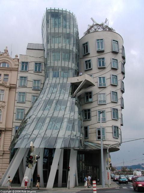
2)The second Gehry building that I really enjoy is titled Dancing Building. I love the way that the central tower spirals around the other, how an extremely dynamic form is integrated into static forms. This is what I appreciate most about Gehry's work, and why I love these two buildings that he designed.
3)The next building I want to discuss is the Robie House by Frank Lloyd Wright. What I appreciate about this house is its extreme horizontal nature. The only vertical line in the entire house is the chimney in the center of the house. I also enjoy how different and groundbreaking this building was in relation to all of the other houses being built at the time that this house was. It was truly an innovation.
4)Next is the Bauhaus by Walter Gropius. This building like the Robie house was also very innovative for its time. Although, I suppose that that is kind of irrelevant statement since all of these buildings I have discussed thus far have been extremely innovative. I love the clean lines and the static elegance of this building. I also love the entire walls of membraned windows.
5)The next building is the Helsinki Central Railway Station by Eliel Saarinen. I really like how the the architecture of this buildings looks both conservative and modern. I also like the contrast of colors that building has of the red brick, green accents and black roof.
6)Whitcomb Conservatory by Albert Kahn. The beautiful full sized dome is what really makes this buiding. The material that it is made out of is likewise very pretty. Further down the more squared off dome looks very natural with this building as do the other angles because the edges are all rounded off so that the blend with the extreme rotundness of the initial dome.
7) Spiral House by Fumihiko Maki. I love the way that the walls of this building are sectioned into cubes. It makes the breaks caused by windows and balconies to seem very natural and uninterrupted. The different heights of the building is likewise a very natural change because of this.
8)Seagram Building by Ludwig Mies Van Der Rohe. The sleek, black elegance of this building is what really captures the viewers attention. I also really like how the solid black cap at the top of the building is balanced out by the equally sized void at the bottom.
9) Kimbell Art Museum by Louis Kahn. I love the repetition of the cylindrical shapes of this building. It is so unique, since I would initially expect a building designed like this to be standing vertically instead of horizontally.
10)Villa Savoye by Le Corbusier. What I appreciate about this building is the contrast of the initial box shape and the cylindrical interior shape. I also like how the window and the open space stay in a consistent line around the entire building. It is interesting to think about what this building would look like were it not on stilts. I think that it would not be nearly tall enough and would look somehow cut off, although I'm not sure what exactly stilts versus the building being taller does for the building. Perhaps it is the void of space that makes it so appealing since the rest of the building is so full and boxy.


No comments:
Post a Comment